What Is Responsive Design?

If you have a website for your business (and I’m sure you do), you don’t want this to happen to your customers! You can avoid this problem by utilizing responsive design! So what is responsive design and how does it relate to you?
WHAT IS RESPONSIVE DESIGN?
Simply put, responsive design adapts to the specific screen size you are using. By designing it in a specific pattern and layout, you allow your website the ability to resize on any size device.
Responsive design is the approach where a designer would create a website in a certain layout so that any design feature can be resized and displayed in a pleasing manner to the user. Development will then implement the design so that browsers respond appropriately. It’s a team effort for sure.
TEST IF YOUR SITE IS RESPONSIVE
There are some great websites out there that will help you test your site to find out how responsive it is… for free! I am going to share 2 websites you can use to test your responsiveness.
responsivedesignchecker.com

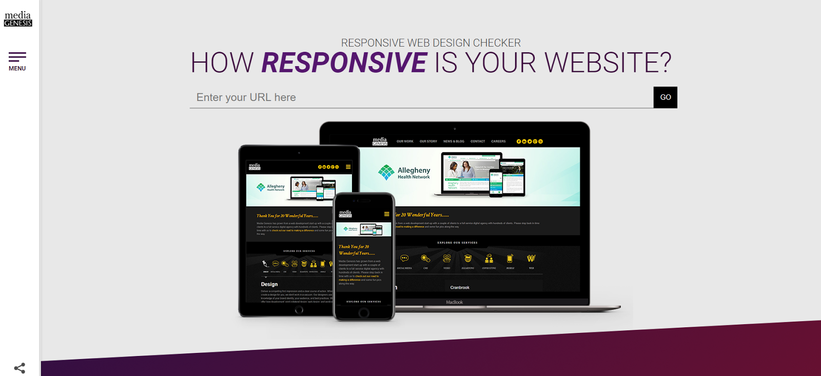
The first is responsivedesignchecker.com which offers a nice clean look and is easy to use. Simply enter your website address into the area that says “enter your URL here.” Click Go, and wait for your website to be displayed.
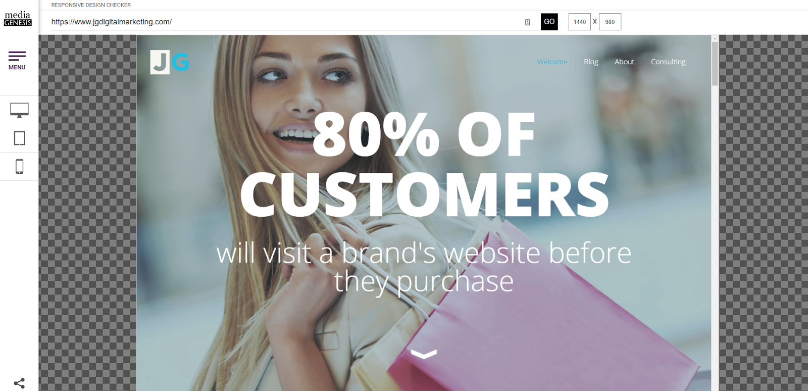
When your screen first loads, you will see what your site looks like on a larger screen. Look over to the left and you will notice options to change the screen size. As you can see below, I clicked the smartphone icon and then selected my phone (which is the S7).
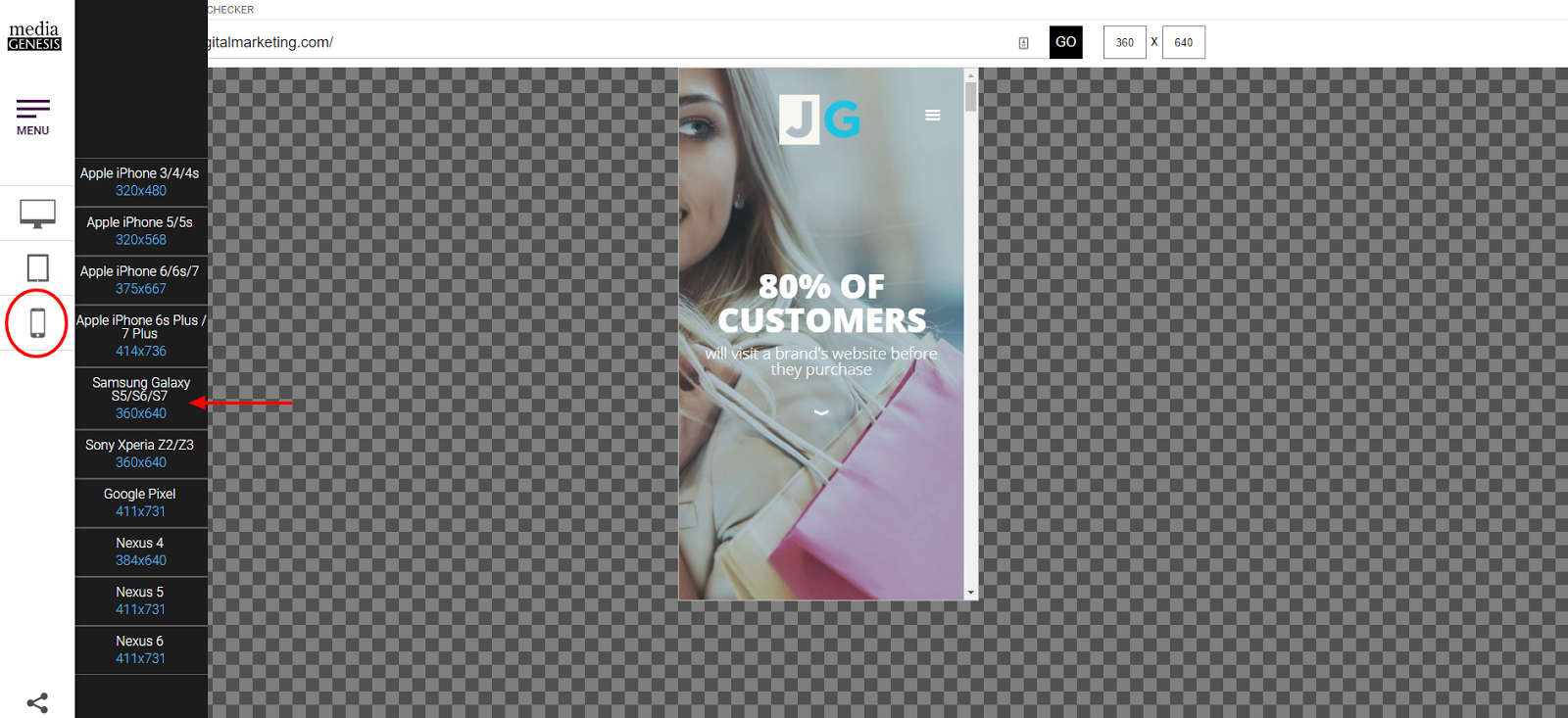
What you are looking for is to see how the content on the site adapts to the device screen size. You can scroll and click around to test out the site; please do. You can select from numerous screen sizes/resolutions. Give it a try and see how responsive your website is.
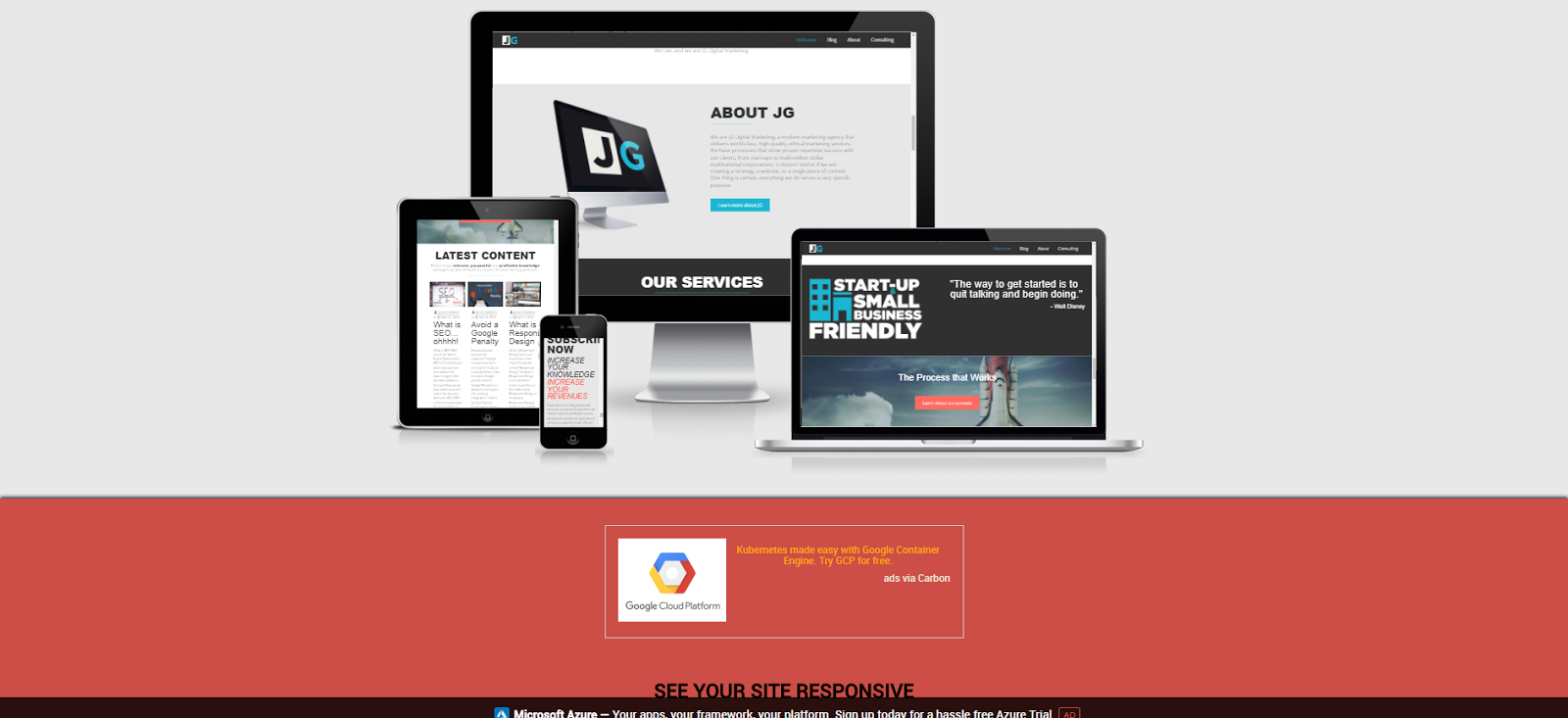
ami.responsivedesign.is
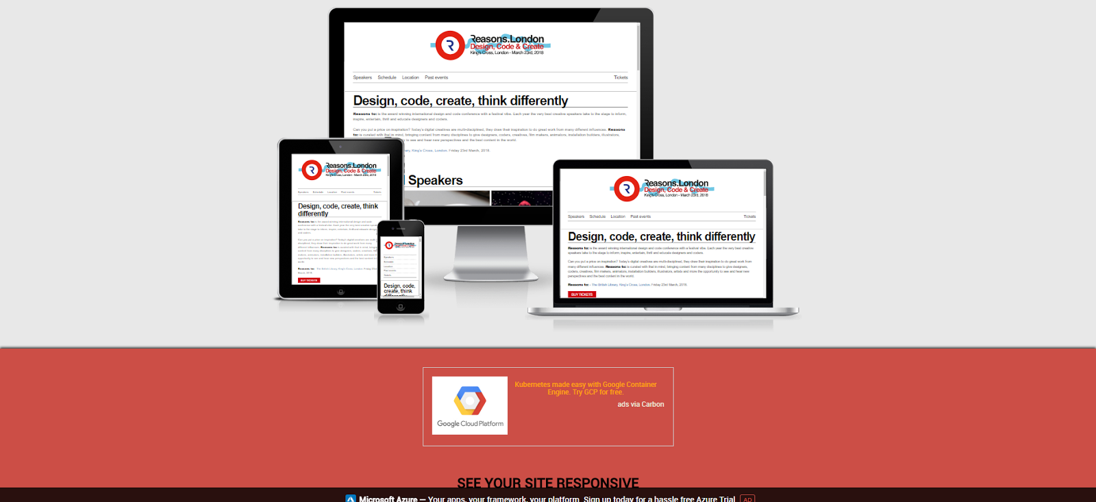
The next website to see your responsiveness is called ami.responsivedesign.is. This site is neat because it shows you what your site looks like on the multiple device display at the same time. I entered in jgdigitalmarketing.com and this is what displayed:
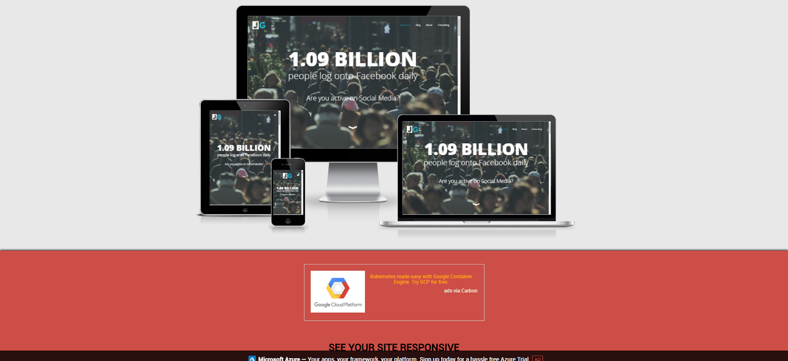
The great thing is you can independently scroll each screen to see how the whole page looks. Take a look at my example below:
WHAT DOES GOOGLE THINK?
Is your website responsive? How did it look on multiple devices? Now, let’s find out what Google thinks about your site’s responsiveness. You can do this one of two simple ways:
- Google “google mobile responsive test” and the search results will load an option for you to enter in your website’s URL; then click RUN TEST. Pretty simple.
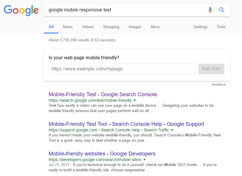
- Or you can visit https://search.google.com/test/mobile-friendly and enter your URL. Both options lead to the same Google-owned website. This is what the site looks like if you visit the link:
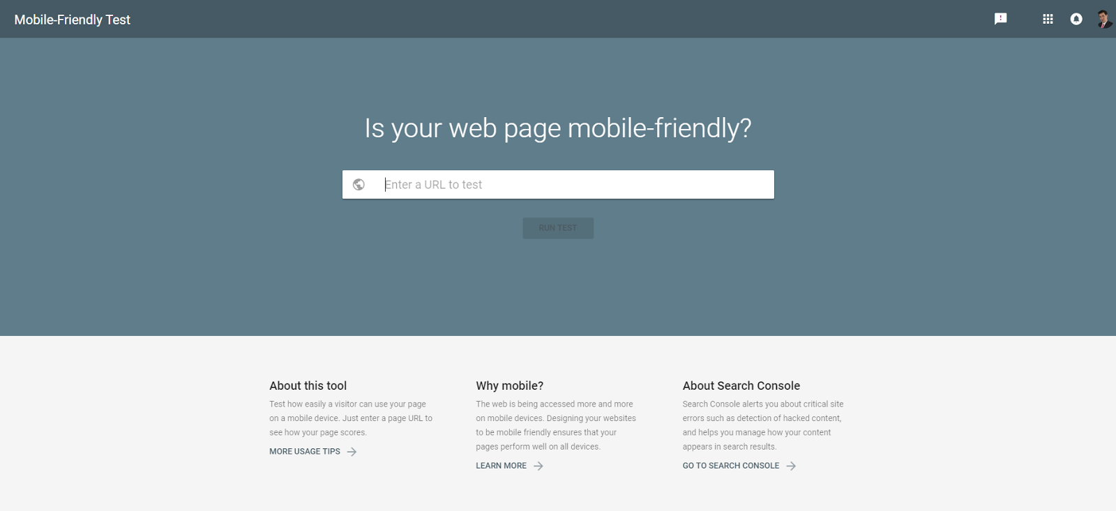
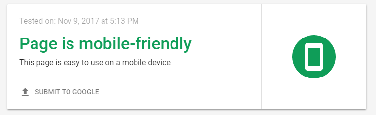
After you run the test, there are only two results. Either you pass or fail. If your website is responsive, you will get a message displaying results such as this:
If you do not have a responsive website, you will more than likely get a message like this:
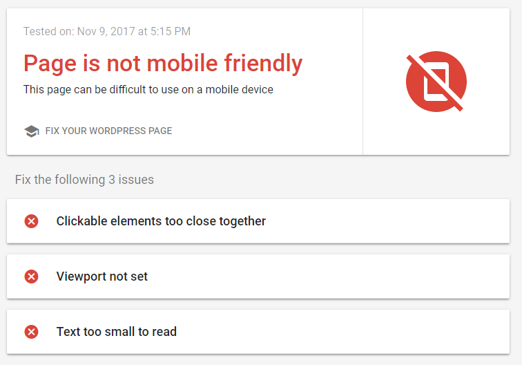
Great job if your website is responsive! If it’s not, you now know a strategic option to help with your core business objectives.
WHY IS RESPONSIVE DESIGN GOING TO BE THE STANDARD FOR ALL FUTURE SITES?
- The world is going mobile. Global mobile data traffic grew 74% in 2015. – Cisco
- The usage of mobile devices is also growing rapidly. In 2015, 68% of U.S. adults owned a smartphone. In 2011, that number was 35%. – Pew Research Center.
- 40% of people will choose another result if a site is not mobile friendly. – iacquire.com
There is no question on how people are responding to particular devices. Desktops do serve a purpose. The one thing that a desktop cannot do is be mobile. Do you want your customers to have a good buying experience?
HOW DOES RESPONSIVE DESIGN AFFECT REVENUE?
In today’s mobile marketplace, if a business intends to remain profitable, then a responsive designed site is absolutely crucial! Overwhelmingly, consumers believe businesses do not care about consumers if they do not have mobile friendly sites. It is all too simple for a potential consumer to quickly navigate away from an unwieldy or incompatible site. Think about that website you opened on your smartphone that didn’t load correctly. Most likely, you closed it and found a different website that served the same purpose. This is common practice, as it should be.
The primary goal of any conscientious business owner is to make his or her service/product available to everyone everywhere. Maximized exposure leads to increased revenue. If you are not available on all devices, then you are not available to all consumers.
CONCLUSION
The data associated with responsive design’s credibility in an ever-expanding market is undeniable. Responsive design is the standard for all websites being created. If you have had a website developed in the last 24-36 months and do not have a responsive design, next time be cautious with whom you work! Make sure your website developer understands the importance of responsive design as a revenue building tool!
GROW WITH US AND SUBSCRIBE
We can only grow and reach our goal with the support of people like you. Please comment or share this article if it has helped you. The more shares and comments, the more FREE content to follow.
Subscribe to our content if you like receiving value sent to your inbox for FREE!
Links
- http://dev.mobify.com/blog/global-screen-size-diversity/
- http://services.google.com/fh/files/misc/multiscreenworld_final.pdf
- http://www.comscore.com/Insights/Press-Releases/2013/6/comScore-Reports-April-2013-US-Smartphone-Subscriber-Market-Share?cs_edgescape_cc=US
- http://www.themobileplaybook.com/en-us/
- http://responsivedesignchecker.com/
- http://ami.responsivedesign.is/#
